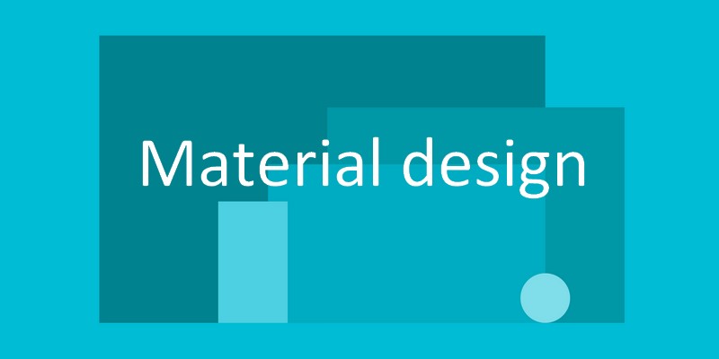
A little while back Google introduced what has quickly become one of the hottest trends in website prototypes: Material Design. Directed towards both web designers and developers, Material Design offers a new take on user interfaces based on a strict yet also flexible set of Material Design guidelines.
Those wishing to achieve a consistent feel to their websites, businesses, or even products, while maintaining a unique brand, are invited to try this new design language as the foundation for their creative look.
With endless materials, color schemes, shapes, patterns, textures, and layouts, this visual interface design aims to “synthesize the classic principles of good design with the innovation and possibility of technology and science.”
What is Material Design?
Google’s Vice President of design, Matías Duarte, says this about Material Design:
“…unlike real paper, our digital material can expand and reform intelligently. Material has physical surfaces and edges. Seams and shadows provide meaning about what you can touch.”
Created in response to the issue of inconsistent user experiences across all devices, Google’s Material Design is a design language based on paper and ink that introduces a flat design that attempts to make your web experience more realistic.
In the past, when users switched devices, say from a desktop computer to their smartphone, they had to adjust to the differing interface looks, layouts, and control settings that were accessed. Google saw this as a problem and began to tackle the issue of inconsistency between the multitudes of platforms people use on a daily basis.
Material Design improves user flow, allows for a smoother and more realistic user experience, and offers consistency across all devices. Taking a more objective approach to design choices, Material Design boasts reasonable limits, but not excessive restrictions when it comes to the design guidelines.
Through the use of things such as animations, transitions, layers, padding, and lighting effects to create depth, Material Design essentially creates three-dimensional components that are viewable and understandable on a web application. This sensory expression creates a unique and consistent look to Google’s brand and is highly attractive to third-parties who wish to unify their business brands as well.
Material Design’s Core Concepts
There are 3 core principles that make up Google’s Material Design: material as a metaphor, motion, and bold intentional graphics. Let’s take a closer look at each of these concepts to gain a better grasp of the idea of Material Design.
1. Material as a Metaphor
Digital Material is the main component of Material Design. Again, inspired by paper and ink, this “Smart Paper” is capable of much more than simply displaying an appealing image on a screen to its viewers. Rather, the fundamentals of light, surface, and movement show how objects exist in relation to each other. In addition, the shadows and lighting provide visual cues to explain an object’s actual existence in space as if the object was tangible in your hand.

Tactile layers make up each material object. Stacked, arranged in differing heights, and casting shadows on top of each other, these objects are displayed realistically so users can understand the interactions between the objects. Here Google strives for a clean, crisp, and simple display of objects. There is no need for excessive texturing or shading to depict existence. While familiar edges, shadows, and lighting help users to understand objects, the advanced technology behind Material Design leaves the developer free to imagine whatever they please, while remaining grounded in the world’s physical reality.
2. Motion
Google’s concept of Motion focuses on the user’s interactions and experience with the objects being displayed rather than allowing the developer to decide all movement. The idea is that the user has control over the design and that the motion that ensues respects the user initiating that movement. Grounded in realism, the surfaces and edges of the material can move and change shape in a way that we as viewers can understand. Gone are the days when an image simply floats off the edge of a screen into oblivion with no rhyme or reason.

Basically, the movement that one sees on the screen makes sense in the real world. Things will collide and bounce according to the laws of physics. Objects will demonstrate realistic movement and provide appropriate shadowing. It is as though the movement were happening in real time.
Google explains that,
“Motion is meaningful and appropriate, serving to focus attention and maintain continuity. Feedback is subtle yet clear. Transitions are efficient yet coherent”.
The concept behind Motion also takes into account the idea of “Digital Ink”. As noted above, the entire concept of Material Design is based around the idea of paper and ink. The layers of design represent the paper, and everything displayed on these layers represents the ink. Using a simple color palette and one font type called Roboto, Google stays true to their desire for a clean and simple design without a lot of added components.
3. Bold Intentional Graphics
To bring the entire concept of Material Design together, as both digital paper and digital ink, Google uses bold and deliberate colors to define the edges, typography, and intentional white space Material Design provides the viewer. The foundation that bold and intentional graphics lay for users is more than just providing an appealing look; it creates meaning and focus behind the image being displayed. It catches the user’s attention, immerses them in the reality of the image on display, and gives meaning to what the user is viewing.

What This Means for Future Web Design
Undoubtedly Google’s Material Design will have strong effects on the future of web design. By helping to create a new era of web design, one that is capable of unifying brands across all devices, Material Design has set the bar on web design principles and does not seem to be going anywhere. Here is what some of the top web designers in the industry have to say about Google’s Material Design:
- Many will use Material Design as an extension of the flat era of design already in place.
- This is the only way to support the wide range of display sizes, ratios, and pixel densities while remaining consistent across all devices.
- This is Google’s way of anticipating the future, staying competitive, and controlling user experience.
- Material Designs paves the way for individual designers to maintain freedom in their creations while creating a unified design principle to follow.
- The concept of Material Design will help developers create at higher levels while also increasing usability and satisfaction.

Final Thoughts
With bright colors, a lightweight yet realistic feel, and a welcoming look, Google’s Material Design looks promising. With added animations to make the user’s experience more playful and exciting, while ensuring a consistency amongst all devices, this adaptive design will provide an optimal experience for anyone that comes across it.
Be sure to check back soon as I explore how you can begin to implement Material Design on your WordPress website. I will take a look at some great examples of websites already utilizing Material Design for inspiration, and show you some WordPress themes that can help you get started with your creation.
What do you think about this new concept of web design? I would love to hear you thoughts in the comments below!