
You’ve developed your website by investing a hefty amount of money and time to make every page perfect. What if your site is performing poorly when it comes to attaining the ultimate goal – an increasing conversion rate? There are certainly some questions that are continually making you worry like how can I increase conversion rate? Is there a way to attain it easily? Will email subscription forms help? What are the right places to position signup forms? Which opt-in forms should be used to increase the number of email subscribers?
Before we start digging deeper, it’s important to understand the benefits of a solid email list and why it’s considered as the most convenient and useful way to increase conversion. Let’s have a glance at the fundamental advantages.
- Email is purposeful
- Email is personal
- Email is one-to-one
- Email is targeted
Now, to answer the questions, we have listed all the answers cum tips that you can use to increase your conversion and keep it going upward.
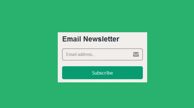
Why your sign-up form is the most important factor?
You might be a blogger or your site may have a dedicated ‘Blog’ page (almost all successful websites do have it where they regularly publish posts related to their upcoming product/service launch, special offers, useful product/service information, recent happenings related to their industry etc to keep the email subscribers updated and stay connected with them) but you can’t survive without email subscribers.
If you want to develop a successful, Google-protected and sustainable blog that will continue to generate revenue over the years, you must have a robust list of email subscribers. Popup Plugins like ConvertPlug, OptinMonster, Thrive leads, Leadpages, Bloom, Picreel will help you build an awesome email list.

8 Second rule you must be updated with
You probably have heard of the old adage that says you get only 8 seconds to engage your visitor. Though this period might have shortened in today’s competitive landscape, some cardinal rules are still relevant when it comes to grabbing visitors’ attention. Some of the rules are:
- Use single column design
- Keep your signup form’s field sizes big
- Perform A/B tests for the opt-in forms
- Make your signup button big and simple to hit
Right place to place opt-ins

- Bottom of the Post: Bottom of the blog posts is one of the most useful places to place your opt-in form. It allows you to capture your engaged visitors’ attention after they’ve just finished reading your valuable content without causing disturbance to their reading experience. You can also put your subscription form within your post. This is especially useful if you’ve lengthier blog posts. It lets you convert the visitors who’re enjoying your content but may not be able to read the complete post.
- Full Screen: According to studies, when we’ve too many options, we become confused and finally we prefer to select none of these. That’s why a full screen opt-in form works quiet efficiently. It’s much similar to a popup but less annoying. When your visitors land on a certain page, the opt-in form rolls down eliminating all other distractions like headlines, links in the menu, buttons, pictures etc.
- Beneath your comment form: Your readers have completed reading the entire post, they’re interested and now they want to leave their valuable comments. Won’t it be great if the readers automatically become your email subscribers after leaving a comment? Placing the opt-in form just below the comment form allows you to convert the willing visitors into email subscribers.
- Custom Sidebar: You can put your email subscription form in your sidebar but that won’t be able to attain the goal – to increase email subscribers. That’s why you need to customize your sidebar in accordance with the type of your posts. For instance, if your post tells ‘how to revamp your home quickly in an affordable manner’ put some valuable freebies, related to home improvement, which your visitors can get by subscribing to your email list.
- In Navigation Menu: Your menu is the ultimate property that you’ve on your blog and your ‘About’ page is one of the most visited pages. Usually, when readers complete reading your valuable post, they tend to explore more about you like who you’re, what you do etc. So, why not leverage their curiosity by placing a link to your opt-in form in the menu probably just after the ‘About’ link?
- Post Excerpts: We’ve already talked about placing the opt-in form at the bottom of a post and its benefits. But that way, you might miss the visitors who don’t make it to the end i.e. the ones who abandon halfway through your post due to some distraction. So, if you want to provide everyone with the chance of becoming your email subscriber, you can keep a post excerpt on the home page and place a ‘click to continue’ link beneath that. This provides twofold benefits: first you can offer a valuable freebie, related to the post, which visitors can obtain in lieu of their email addresses and second, they can understand the value of your post by having a glimpse of it and become more interested to sign in.
- Top Bar: Top bar is a proven way to increase the number of email subscribers. Unlike other places where opt-in forms are only visible at a certain time (like when the readers have scrolled down to a certain point or they’re about to leave your page) or on specific places of the site, top bar always remains visible. No matter how much visitors scroll down, they can always see the subscription form.
- Scroll Box: Scroll box, like the top bar, is another proven method to increase email subscription. The scroll box containing the opt-in form only becomes visible when a visitor scrolls down to a certain pre-defined point of your post. To make it absolutely non-annoying, you can place a cookie to track the visitor’s behavior so that the box closed by the visitor becomes visible again only after a pre-defined period of time. The main advantage of scroll box is that you’re not disturbing the reading experience of the visitor. Instead, they’re allowed to read the maximum part of the post and then the scroll box shows up with a relevant optin.
Want to know about more places?
Apart from the above mentioned places, there are some other useful places too where you can put your opt-in form. The ‘About’ page of a website gets the maximum footfalls in most cases. By virtue of human nature, after reading your valuable post, visitors would want to know more about you, your business and your vision and mission.
And that makes this page a useful place to put your subscription form. Embedding your signup form in a video is another powerful way to convert visitors into email subscribers.
You can put the email capture form within the embedded player at any of your favored time during the video i.e. at the start, halfway through or at the end. Though content upgrade can be offered at any page of your site, it might become a little tough, especially when you’ve a limited or a lot of web pages.
In that case, you need to prioritize the pages that matter to your business the most and then offer content upgrade only for those pages. Use the tips described in this article to place subscription forms at the right positions for your visitors and you’ll be able to experience a noticeable growth in your email subscriptions for sure.