

HTML5 grid offers many benefits. You can use it to effectively display a large amount of data through infinite scrolling and paging. However, developers make a lot of mistakes or assumptions. As a result, they can’t make the most out of it.
In this post, you will find seven horrible mistakes that you are making with the HTML5 grid. Also, you will find their fixes. Let’s dive in.
What mistakes are you making with the HTML5 grid?
- Underutilizing the power of HTML5 grid rows
- Graceful degradation and browser support
- Numbering system
- Media query breakpoints
- HTML5 grid replacing everything related to layout
- Using 12 columns all the time
- Hesitating to play with HTML5 grid
Developers make several assumptions and mistakes on the HTML5 grid. Have a look at some most common mistakes:
1. Under-utilizing the power of HTML5 grid rows
HTML5 grid rows are very powerful. They help you define rows and allow you to display a lot of data effectively. Also, grid rows can make all the elements fit nicely, even if they are shrunk.
All you have to do is use rows with the auto-property. It will make everything responsive. As a result, readers can conveniently go through it on any modern device.
However, not everyone knows the massive power of HTML5 grid rows. Therefore, it remains underutilized.
To make the most of it, you must know and follow the best practices. It can make your life a lot easier.
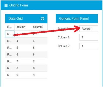
The grid of Sencha Ext JS offers powerful features. It enables you to perform a variety of row and column operations. For example, you can drag and drop rows from the data grid to the generic form panel.
It also supports paging, infinite scrolling, and live data rendering features. It helps you easily navigate through thousands of rows and columns.
2. Graceful degradation and browser support
Graceful degradation is a design philosophy. It refers to the compatibility issue of modern websites on older browsers, like Internet Explorer. The site you are building will work great on the latest browsers, like Google Chrome.
However, it might not work well on older online surfing tools. Your website will still have the essential information and functionality. But it won’t deliver the same user experience as on modern web browsers.
For this reason, many developers are reluctant to use HTML5 grids. They are worried about the poor user experience.
However, they are fully compatible with the most popular web browsers, including Chrome, Safari, and Mozilla Firefox. Also, it allows you to solve compatibility problems with older tools, like IE11. All you have to do is use browser prefixes, like this:
.site{
display:-ms-grid;
display:grid;
-ms-grid-columns:2fr 1fr;
grid-template-columns:2fr 1fr;
grid-template-areas: "header header"
"title sidebar"
"main sidebar"
"footer footer";
margin:20px;
padding:10px;
border: solid 2px #000;
}
Notice that you are using “-ms” prefixes. It’s for Internet Explorer.
The Sencha Ext JS grid offers various features. You can deliver an amazing user experience on all browsers by utilizing them.
For example, you can use onResize to change the browser viewport size. As a result, your site will show up perfectly on all browsers.
3. Numbering system
Many people are confused with the numbering system of the HTML5 grid. In Bootstrap, you are used to counting the number of columns in a row. But in the HTML5 grid, the numbering refers to lines. For example, 7 columns will have 8 lines. If you move from grid lines 1 to 8, it will span 7 columns.
Make sure to keep this in mind while working on grids. It will help you to avoid making mistakes effectively.
4. Media query breakpoints
Breakpoints in the media query enable you to define the number of columns you need in particular screen size. However, you don’t have to use them all the time. With HTML5 grid, you can simply utilize grid-template-columns, min-max, and auto-fit properties to bypass media query breakpoints. As a result, you can quickly get the job done with less code.
5. HTML5 grid replacing everything related to layout
The world of web application development is dynamic. You will always see the emergence of new technologies. But it doesn’t mean that old techniques are irrelevant and useless.
Many developers think that the HTML5 grid has completely replaced flexbox and float. They feel that it’s no longer necessary to use the specific properties. But is it the case? Not. Flexbox and float are still very important. They have their use cases.
For example, you can easily wrap a text around an image with the float property. Therefore, you should not assume that the HTML5 grid has replaced everything related to layout.
6. Using 12 columns all the time
Back in the day, the concept of 12-column grids was massively popular. Developers followed the approach to developing web applications. However, you no longer have to use 12 columns all the time. It works a bit differently than the previous system.
HTML5 grid focuses on creating the number of columns that you need. It is possible to create a web application with 3 columns based on the requirement. If you don’t need 12 columns, there is no point in creating them. Instead, you can create 3 columns and get on with the design.
There’s no issue with this approach. You can still create perfectly responsive web applications without any hassle. FusionCharts is a comprehensive JavaScript charting library.
7. Hesitating to play with HTML5 grid
The best way of learning grids is to not use them during tight deadlines. Instead, you should try playing with them in your free time. How about experimenting with them on personal projects? It will help you to know the power of the HTML5 grid. That’s why you should never hesitate to play with it.
Sencha Ext JS offers plenty of live code examples for HTML5 grids. By following them, you can easily create personal projects. As a result, you can practically uncover and utilize the massive power of the HTML5 grid.