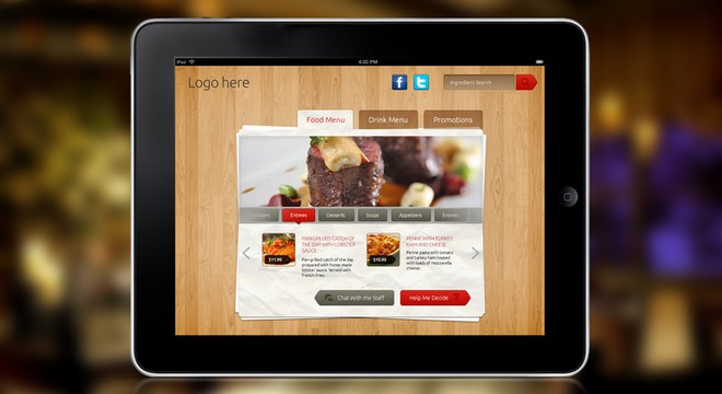
The need for designing websites that could adjust to almost device screen size has encouraged web professionals to embrace responsive web design (RWD) approach.
And so, developers across the globe are adopting tools and methodologies that make development and deployment of responsive web designs easier.
Albeit adaptability to user’s device screens and resolution is the most important factor and first frontier of RWD, but there are several other aspects as well – that helps to enhance a website’s user experience.
Today people urge for optimal web experiences in the most efficient manner possible. Like the ability to gain access to critical information that not just respond to the device they’re using, but also to their location and so on. In a nutshell, you need much more than just a responsive design to grab user’s attention.
Fortunately, the responsive web design community offers more advanced solutions to help meet user’s ever-growing needs. In this post we will dig a little deeper about responsive web design, so as to know what lies ahead in the future!
Reuse of Elements
Web designers invest massive amount of their time and efforts on responsive web design approach. However, the approach soon become outdated in the future and is no longer used. But in the coming years, you may witness use of the already developed RWD solutions that will help to reduce designers work. Put it simply, web designers would be able to reuse the elements that were added to the responsive web design toolkit.
Better and Optimized Responsive-Web-Design
In the next few years, you’ll observe how web designers will put into practice better and deeper insights into creating websites optimized for new mobile platforms. A lot of new and innovative tools will be made available to create new responsive web design solutions. In addition to this, things such as off-canvas panels and others will be used more commonly by designers for websites having responsive web design.
The newly developed tools will help make designing responsive web designs a hassle-free task for designers. They’ll probably be able to implement device capability detection and load assets in their responsive designs that will optimize its speed.
More Visually Appealing Responsive Designs
Responsive designs as of now have limited visual appeal. But in the next few years to come, RWD framework will come packed with more opportunities that will help in enhancing the visual aesthetics of responsive design. Designers will be able to create stunning responsive designs – with help of complex tools and improved web design components.
A number of visually appealing responsive templates will be made available that would fit every user’s device needs. In a nutshell, highly innovative templates will become available in the future to users with good typography, plenty of color schemes and well-designed layout.
Increased Usage of Responsive Images

In the year 2015, you will observe increase in the use of responsive images. Till now, SVG (Scalable Vector Graphics) are used to handle higher DPI screens – that helps to scale an image to fit the device screen of any resolution, by keeping the file size of an image as small as possible.
Responsive Design Will Go Beyond Conventional Displays
Other than building responsive designs for the conventional devices like smartphones, tablets, desktops etc. The web professionals will focus more on building RWDs in the coming years – that would run smoothly on wearable computing devices as well – like watches, etc. That’s not it! The way several electronic brands today offer television sets with built-in apps as well as browsers, you may witness development of smart television sets that would run responsive websites.
Let’s Wrap Up!
Responsive web design is not just limited to creating designs that adapts to different device screens. And it’s not merely about delivering users with a design that fits to their mobile device, and responsive design needs to adapt to several other user’s needs.
In the coming years, you will witness lot of changes in the way responsive designs are created. Right from reusable elements, to visual enhancements in the templates and building responsive designs for devices apart from the conventional ones.
In simple words, responsive web design would undergo several changes in the future years. Reading this post will hopefully make you learn about the changes that lies ahead in the future of RWD.

