

Today’s internet is much different to the internet that we used to know. The majority of users are browsing the web not from their desks or even their laps, but from their phones and their tablets. Those iPads you see people carrying around? That’s their main portal to the web. These users aren’t interested in yesterday’s web design and they’re content in moving around a desktop-orientated website, they’ve come to expect better, to expect more from their websites.
This is bad news for blog owners as traditional WordPress themes are just not impressive when viewed on a smartphone or tablet. So, what can you do about it? Well, you can find a decent responsive WordPress theme for your blog. A responsive theme is one that responds to different browser platforms. On a desktop, you’ll see the regular look but, on a smartphone you’ll see a much more “app-like” look and feel. The same goes for iPads and tablets, too. A responsive theme makes your content easier for mobile users to absorb and relate to. The question is, just what should you be looking for when trying to choose one of these themes? Read on to find out.
Take a Good Look Around and Try Some Out
Thanks to WordPress being the largest blogging platform out there, it’s pretty easy to find plugins and themes for the platform. There are hundreds of free responsive themes out there but, with a lot of choice can come some headaches. It’s great to have such a wide variety of choice but, you shouldn’t settle on the first nice-looking theme you see. The theme you ultimately choose for your blog should be relevant to your content and your audience. For instance, if you were running a blog about inbound marketing tips you would choose a relatively neutral theme that’s professional in feel, while a blog for motorcycle enthusiasts should have more of a fun, image-heavy theme.
To start things off, you should take a look at the many free themes available to see if they can offer what you’re looking for. Some of them are pretty great for those of you on a budget but, if you’re looking for that professional feel, you should consider paying for such a theme. Sites like Themefuse allow you to filter results to only show responsive designs, and they offer some attractive prices, as well.

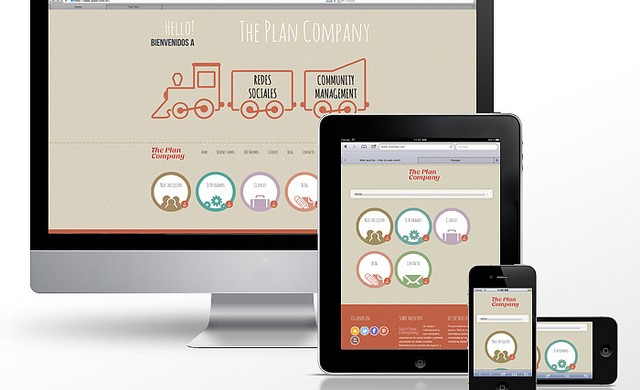
A Comprehensive Responsive Framework
First and foremost, the theme you settle on should work, and work well no matter where your readers are accessing your site. That means a lot of testing on your part when you find a theme that looks the part and you’d think would be a good fit. When testing themes online, you can only really test out how the desktop layout looks, which isn’t of much help if you’re trying to design something for mobile. You can try out WordPress’ own responsive design tester which is a great place to start but, it’s no substitute for the actual devices in your hand.
You should set up a test site online and try it out with as many different devices and screen sizes as you can get your hands on. Whether they’re Android phones, iPhone or Windows Phone devices you need to get a feel for what your readers are going to see when they dial in to your site from their smartphone. The only way you can be sure if something is going to work properly is to test it out rigorously and put it through its paces.
Make Sure Your Blog is Still Your Blog, No Matter What Size
Having a blog that looks as great on smartphones and tablets as it does on desktops and laptops is great, but you mustn’t lose track of what you’re trying to do with your site. You should, above all, try and retain the feel your blog has on the desktop no matter what device people are viewing it on. It shouldn’t morph into an entirely different experience when viewed on a different device.
When choosing a responsive theme for your blog, you should try and find one that’s similar to the one that’s already in use, as that’d be the easiest way to make sure your readers will still get the same experience no matter what device they’re using.