

As we move into a digital marketing era, businesses have become more crucial to advertise themselves effectively and make educated decisions to optimize income and sales.
The most effective method to do so is to visualize your data. This may assist businesses in detecting flaws and faults in their business architecture, allowing for a more targeted approach to resolving difficulties.
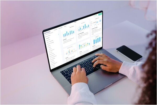
Projecting data on web pages is an everyday use case in various industries, and it necessitates the usage of a data visualization tool.
Developers frequently use these tools to generate spectacular data visualizations that are visually appealing, dynamic, and responsive. If you’re searching for a new data visualization tool, picking one that’s right for you might be challenging.
Several alternatives are available, each geared at a distinct demographic, making the procedure time-consuming. Continue reading to learn more about data visualization frameworks and how to get the most out of them.
- What features should you look for in your data visualization tool?
- Why is solid visual rendering crucial?
- How does a steep learning curve impede accurate data visualization?
- Does a data visualization tool offer you value for money?
- How is a data visualization tool an absolute game-changer?
What features should you look for in your data visualization tool?
An ideal data visualization tool should be quick, easy to use, cost-effective, and dependable. It should be configurable so you can fine-tune it to your specific needs. Let us discuss some features that make up an ideal data visualization tool.
Why is solid visual rendering crucial?
When considering getting the most out of your data visualization tool, the outcome of your data visualization framework matters a lot.
Your data visualizations must be visually appealing and free from congestion and unnecessary information. Impressive data visualizations strike a balance between the aspects above and render optimally based on the nature of visualization.
You must carefully decide on your themes and visual elements since they should match and correspond to your website’s front-end aesthetic.
This will ensure your visualizations look stunning and befitting of the content present on your website while communicating the critical insights with complete clarity.
FusionCharts allows customizing the data and graphing methods while simplifying the visualization process. For example, you can present your data using pre-built interactive charts and maps – whether in the shape of a tiny dataset or an extensive data collection.
You display your company’s insights and convey your ideas accurately. It feels consistent with many installation options, such as direct JavaScript, CDN, and NPM.
It is pre-integrated with popular JavaScript libraries and back-end programming languages, making it an ideal data visualization tool.
How does a steep learning curve impede accurate data visualization?
You need a data visualization tool that balances powerful features and simplicity. Ease of integration and usage directly corresponds to your company’s success and increases productivity.
Most data visualization tools are packed with features but lack ease of integration and usage, making them unsuitable for novice developers. FusionCharts is simple to set up and use; you can create your first chart in 15 minutes.
Because of its uniform API across charts, it’s simple to create complicated data dashboards and plots.
FusionCharts will even help if you get stuck in your thought process by providing a wealth of ready-to-use chart examples, industry-specific dashboards, and even data stories, all of which come with source code to get started immediately.
Most developers are fed up with data visualization tool assistance that falls short of expectations, affecting productivity and tarnishing the company’s reputation in the case of a crisis.
This tool avoids this by providing detailed documentation and multiple live examples for each library or programming language.
Does a data visualization tool offer you value for money?
Most data visualization tools are powerful but difficult to use and integrate. As a result, individuals and businesses constantly seek methods to decrease expenses while increasing profit and income.
Yet, these data visualization tools may burn a hole in your pocket. Depending on your customized plan, these tools range from $2,000 to $4,000.
FusionCharts provides value for money. You can completely fine-tune it to your needs to create stunning online and mobile dashboards.
You can implement thousands of sensor data points for your IoT application. It can render millions of data points in the browser, which is incredible value for money!
How is a data visualization tool an absolute game-changer?
A data visualization tool aims to help businesses and individuals visualize their data effectively with stunning visuals while keeping the process budget-friendly.
FusionCharts has various installation options (direct JavaScript, CDN, NPM) and is pre-integrated with all popular Javascript libraries and back-end programming languages, as well as extensive documentation to assist you in the event of a malfunction or system error.